Article
Choice Overload: It’s not about the number
Published on September 21, 2023
Practical advice for overcoming Choice Overload
Your users are overwhelmed by the number of options that your app provides. Your only solution as a product manager; reducing options. Or at least, that is the story you are being told. But is that right?
Not quite.
Choice Overload is a well-studied phenomenon wherein decision-makers become overwhelmed with too many options to choose from. Whether it is the number of routines on an exercise app or the number of flavors of jam at a supermarket, the outcome is the same - indecision and eventual dissatisfaction with their choice as the decision-maker thinks about all the other options they gave up. The most common advice given for this problem is simply to reduce the number of options.
But consider this; how many different things could you be doing right now? Can you count the options you have? You could stop reading, tell your boss that you quit, do chores, eat a sandwich or a salad, play a game, join the circus, or an infinite number of other things.
Yet, you are not experiencing Choice Overload every minute of every hour of every day, and not in a state of constant rolling regret over how you spent the last 10 seconds of your life. Most people are not so overwhelmed with the infinite set of possibilities they have every second of their life. So why is it that your users are reporting being overwhelmed?
Consider also that a similar paralysis and dissatisfaction can occur even when only considering a couple of choices, such as at a restaurant with a limited menu. Clearly, things are not as simple as the ‘number of options’. There is something deeper going on.
So what causes Choice Overload, and how do you fix it?
Part of the answer is “uncertainty”. Users are uncertain about the options they are choosing between, uncertain about their own preferences, and uncertain about the best way to make a decision. But this explanation is still incomplete. Uncertainty is a constant in life, and more often than not, we handle it all right.
It’s not just regular old uncertainty that causes the experience of Choice Overload, rather it is uncertainty about how to manage the uncertainty that leads to that sense of overwhelm that your users are experiencing. This causes complexity for the user as they don’t know how to manage the choice. This stems from three principal sources, all of which can be influenced by product managers and their teams.
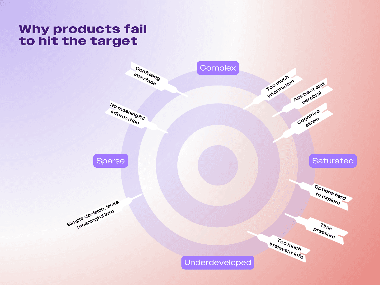
In apps, as with life, experience teaches us how to manage most forms of uncertainty. If we’re unsure, we know how to check, what to check, and have a good sense of how the new information fits into the broader picture. Relevant information is easily found and integrated into our decision-making process.
"So how can Choice Overload be managed? By designing interfaces that facilitate understanding, discovery, and decision-making — or what has been called Choice Architecture"
But in situations where we are unfamiliar, or where the interface we interact with isn’t quite intuitive enough, we struggle to figure out how to manage all this uncertainty. In these cases, it’s not the number of options that leads to Choice Overload – but the increasing amount of uncertainty and complexity in the choice.
So how can Choice Overload be managed? By designing interfaces that facilitate understanding, discovery, and decision-making — or what has been called Choice Architecture. This may involve adding or subtracting information or choices, but there are more ways than one to manage this all-too-common problem. If the interface is designed in a way to help users make sense of the information in front of them, then they may even enjoy the multitude of options that are provided.
In this article, we will consider a few principles and tactics of Choice Architecture to help minimize the Choice Overload that users can sometimes experience when navigating many options.
Strategy 1: Add different levels of granularity
Ice cream parlors manage the problem of Choice Overload pretty well – while not completely solving it, they do manage to greatly reduce the number of people feeling overwhelmed by their choices. They do this by spending very little time describing the ice cream, and instead, provide customers with three different levels of granularity to better understand the ice cream options – a sort of progressive disclosure of increasingly more information.
As the first level of granularity, the ice cream is displayed behind glass, oftentimes with the main ingredients showcased on top. This setup allows customers to have a first glance at all the possible flavors and shortlist their initial favorites, providing a sense that they have seen all the options in enough detail to not feel a sense of FOMO.
The next layer of granularity is generally a tag describing the ice cream flavor in more detail. If the first level of granularity wasn’t enough to make a choice, this more detailed tag helps customers narrow down their choices even further. This requires a little more effort than just looking at the ice cream, but provides just enough detail to get to the third layer of granularity.
The final layer of granularity is the test spoon. While more time-consuming, it’s often the step that clinches the decision. Customers generally won’t try more than a few flavors as they have already narrowed down their preferences by this point. This is good. If the customer had to try all 31 flavors at Baskin Robbins, a famous ice cream chain in the US, in order to make a decision, the experience would be overwhelming (Not to mention less than cost-effective for the ice cream chain).

While ice cream parlors encourage tasting spoons, they do strike a balance. They rely on social pressure to prevent people from trying out too many flavors. While this can cause some anxiety, it is a trade-off parlors are willing to make. After all, without this tasting etiquette, taste spoons could easily become unlimited ice cream for free!
Good Choice Architecture will often also have layers of granularity like an ice cream parlor. A layer that allows fairly comprehensive scanning, a layer that provides some more detail, and a final layer that allows an in-depth understanding.
"Good Choice Architecture will often also have layers of granularity like an ice cream parlor."
Consider the onboarding process of a fitness app. When users log in for the first time, they're presented with different levels of information about the available workouts and programs.
The first level offers a quick overview for browsing through and the second offers more detailed information. By presenting different depths of introduction, the app helps users compare various workouts at a glance and allows users to dive deeper into the specifics of programs of interest. But why stop there? A third level of granularity could offer users a taster-spoon equivalent, which could take the form of a chatbot, customer support, or an onboarding call to guide them further in understanding programs and choosing one that fits their needs.
Strategy 2: Format information for easier decision-making
A common misperception is that more information will decrease uncertainty. But this is not always the case — sometimes it does just the opposite. If users don’t know how to represent, keep track of, and use the information in their decision-making process, the additional information will just be noise that will complicate the process of deciding.
"A common misperception is that more information will decrease uncertainty. But this is not always the case — sometimes it does just the opposite."
So how do you address uncertainty if more information is overwhelming?
Information comes in many forms, some of which are easier to take into account than others. Just as computer files need formats, thoughts are given structure in experiences, visuals, and narrative. By structuring the information in ways that are intuitive for humans, complex choices can be simplified.
One notable example was a video looped on the Peleton landing page in 2019. The video lasted about 15 seconds and showed three types of shots that all helped viewers get a better sense of the product.
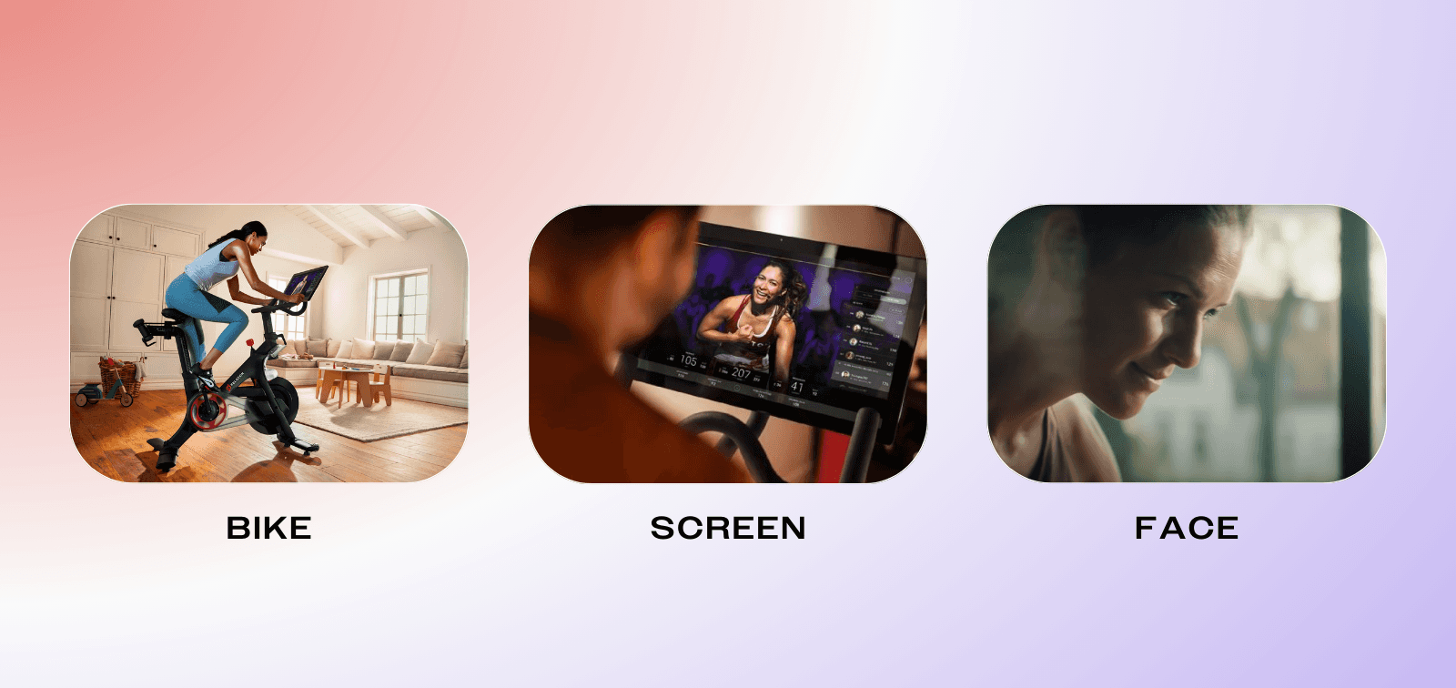
The types of shots included a person working out on the bike, the video played on the screen of the bike, and a zoomed-in view of the person’s face while on the bike. These shots demonstrate, respectively, what it looks like, what keeps someone entertained and motivated while on the bike, and the sense of determination and commitment that users can have.
Each of these shots answered a question that someone might have; How will I look? What will I be doing? How will I feel? The answer to these questions was not based on science or clever statistics, but on a visual demonstration that helped users understand the value of the bike immediately. What could have been a FAQ was instead something the user was able to experience.
Some believe that the way people make decisions is by considering all the options and their features, and choosing the option with the best features. But that is rarely how people choose in reality, and even more rarely how they want to choose. Instead, a much more common tactic for decision-making is to imagine possibilities until one of those possibilities is compelling enough to be chosen. That is why pictures, videos, samples, or even narrative descriptions that allow users to imagine what it would be like to choose a certain option, can be much more compelling than a written description.
Strategy 3: Align interface with mental models
Anyone who has switched between an iPhone and an Android, or between Windows and Mac knows the importance of mental models. For the first few minutes (or even months) after picking up a new OS, there is a confusion. You keep trying to do and find things, and nothing quite works as it should. Your mental model – that is your understanding of how all the various pieces work and relate to each other – doesn’t quite map to the reality of it.
To make sense of the world, we often rely on previous knowledge and especially on previous mental models. These often facilitate, but they can also get in the way if they are misaligned. To ensure that users can understand, discover, and make good decisions, they need a good mental model of the product or app product they are using. To support this, we can use elements of other mental models they are likely familiar with.
"To make sense of the world, we often rely on previous knowledge and especially on previous mental models."
An example of this can be found in Trello, a task management tool, which helps users understand new concepts of their products by aligning with already existing mental models. In this case, it uses the mental model of the ‘to-do list’ to make people familiar with Trello’s new concept of ‘cards’. By using something people are familiar with, they make the tool easy to use even when it is crowded with cards and tasks.
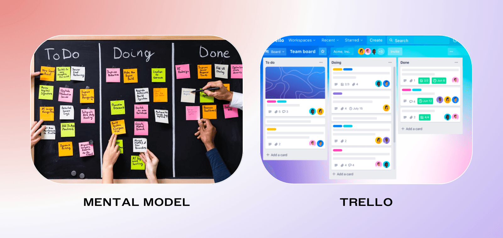
Joel Spolsky, the creator of Trello, says that the creation of Trello was based on his experience working on Excel. Excel is an example of a product that just intuitively aligned with people’s existing mental models, leading to great success.
“Round about 1993 a couple of us went on customer visits to see how people were using Excel…Over the next two weeks, we visited dozens of Excel customers, and did not see anyone using Excel to actually perform what you would call “calculations.” Almost all of them were using Excel because it was a convenient way to create a table.”
The ‘table’ is a way of structuring information that is highly intuitive, and turned out to be the chief value of Excel. For Joel, this helped trigger a recognition that the value of Excel was not in the calculations, but rather in the ability to represent data in a certain convenient structure that the user controlled. That is to say, Excel allowed for greater alignment between the user’s mental model, and the data they were seeing. That is what made Excel a success over its more technically complex competitors, and also what has made Trello as successful as it has been. Not the technical complexities, but just allowing a match between mental models and how information is represented.
It may involve some user research to understand a user’s mental model. You might ask users what they anticipate seeing when they click on something, or how they think about the hierarchy of information. Understanding potential misalignments in their mental models and your product will help determine what needs to be changed, or what you need to do to help users understand. Either way, the key is to match the user’s mental model to reality in a way that reduces the overwhelm that comes from searching for information in an unfamiliar interface.
Strategy 4: Allow for exploration before exploitation
"Studies show that when users just browse, and are less concerned about making an optimal choice right away, this reduces choice overload."
Not knowing whether you’re making the right decision or not can lead to hesitation and less satisfaction. To make the decision-making process less daunting, it can help to relieve that pressure and remind decision-makers that not all choices are permanent and that there is time and space for learning and recalibration.
Studies show that when users just browse, and are less concerned about making an optimal choice right away, this reduces choice overload. One of the authors (Jared) and his wife learned this through experience when they had to buy stuff for their first apartment. Jared has never been accused of having style, unless the style was called ‘spartan’, and so he didn’t bring much to the new apartment when he and his newlywed wife moved in together. Additionally, his wife had left most of her stuff behind with her roommate. As a result, they needed basically everything that an apartment typically needs, from couches to curtains to lamps to bookshelves.
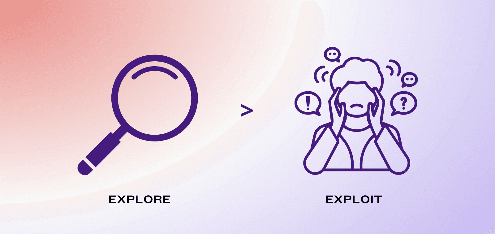
However, despite this being the perfect opportunity for Choice Overload, Jared reflects fondly on this time. Scrolling through his wife’s pinterest account in a bare apartment, trying to figure out what ‘their style’ was going to be. Walking the aisles of Ikea, sitting down on all the office chairs, and trying all the desks. There wasn’t an immediate pressure to decide, and so instead it was a time to explore what they liked, and to get a sense of what is reasonable.
If users feel they are in ‘exploration mode’ rather than ‘final decision’ mode, this reduces the pressure to make the perfect decision. Additionally, to lessen the pressure of making the ‘perfect’ choice, you can introduce a safety net allowing people to reverse or modify their choice later on. This can take the form of trials, return policies, version histories in design tools or simple ‘go back’ buttons in application forms. By allowing people to experiment and potentially make changes, this technique reduces the pressure associated with decision-making, while encouraging exploration.
Encouraging exploration through how the experience is framed, or through adequate safety nets, users can approach decisions with a sense of curiosity rather than hesitation, making the overall process more user-friendly and reassuring. This further reinforces the notion that choices are part of a journey rather than a final destination, resulting in a more relaxed interaction with the product or service.
Conclusion
The conventional view of Choice Overload, focused on the number of options, fails to grasp the nuanced realities of human decision-making. Choice Overload isn’t merely about the number of options – it’s about the uncertainty and complexity around making the decision. Increasing the number of options can of course magnify this problem, but that does not mean the problem is as simple as the number of choices.
"The conventional view of Choice Overload, focused on the number of options, fails to grasp the nuanced realities of human decision-making."
In response to the idea that Choice Overload is actually about uncertainty, some may think that providing more information is the best way to handle uncertainty, but this may make the problem worse. Instead, what needs to be considered is how to align the information with how people actually process information. It’s not about stripping down choices or adding information, but about crafting a structured environment where users can make sense of choice options in a way that resonates with their cognitive and emotional needs.
The insights mentioned in this article shed light on the nuanced nature of Choice Overload and goes beyond oversimplified solutions. Through elements that structure information to aid in 1) easy understanding, 2) easy discovery of preferences, and 3) easy decision-making, we can foster choice environments that promote exploration, discovery, and an enjoyable decision-making process. This leads to more human-centered products and services, ultimately resulting in more satisfied users.
References
Ward, P. (2023). Choice, Uncertainty, and Decision Superiority: Is Less AI-Enabled Decision Support More?. IEEE Transactions on Human-Machine Systems. https://ieeexplore.ieee.org/document/10177274
Thaler, R. H., & Sunstein, C. R. (2009). Nudge. Penguin.
Ward, P. (2023). Choice, Uncertainty, and Decision Superiority: Is Less AI-Enabled Decision Support More?. IEEE Transactions on Human-Machine Systems. https://ieeexplore.ieee.org/document/10177274
Klein, G., & Crandall, B. (2018). The Role of Mental Simulation in Problem Solving and Decision Making. https://doi.org/10.1201/9780203748749-11
Atance, C. M., & O’Neill, D. K. (2001). Episodic future thinking. Trends in Cognitive Sciences, 5(12), 533–539. https://doi.org/10.1016/s1364-6613(00)01804-0
Johnson, S. G. B., Bilovich, A., & Tuckett, D. (2022). Conviction Narrative Theory: A Theory of Choice Under Radical Uncertainty. The Behavioral and Brain Sciences, 1–47. https://doi.org/10.1017/S0140525X22001157
Young, I. (2008). Mental models: Aligning design strategy with human behavior. Rosenfeld Media.
How Trello is different. (2012, January 6). Joel on Software. https://www.joelonsoftware.com/2012/01/06/how-trello-is-different/#:~:text=The%20biggest%20difference%20you%27ll,and%20web%20browsers%20are%20horizontal
Chernev, A., Ulf Bockenholt, & Goodman, J. (2015, April). Choice Overload: A Conceptual Review and Meta-Analysis. ResearchGate; Wiley. https://www.researchgate.net/publication/265170803_Choice_Overload_A_Conceptual_Review_and_Meta-Analysis


